Give your applications a professional look!
 |
Yes! This class is included in the latest SoftechSoftware DLL version. |
Description
CButtonST is a class derived from MFC CButton class.
With this class your applications can have standard buttons or new and modern buttons with "flat" style!
Main CButtonST features are:
- Standard CButton properties
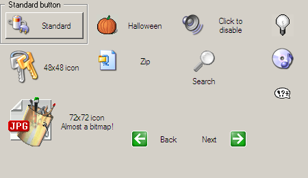
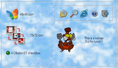
- Text and icon (or bitmap) on the same button
- Only text or only icon/bitmap buttons
- Support for any size icons (max. 256 colors)
- Support for bitmaps
- Support for transparent buttons (for bitmapped applications)
- Standard or flat button style
- Change runtime from flat to standard style
- Buttons can have two images. One when the mouse is over the button and one when the mouse is outside (only for "flat" buttons)
- Every color can be customized
- Can be used via DDX_ calls
- Can be used in DLLs
- Can be dinamically created
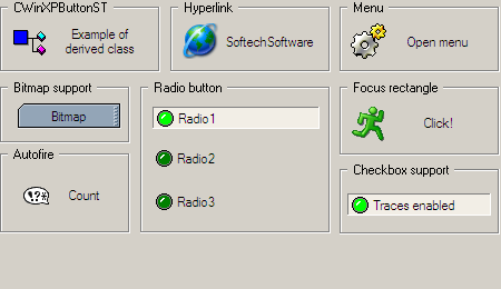
- Support for checkboxes
- Support for radio buttons
- Each button can have its own mouse pointer
- Button is hilighted also when the window is inactive, like happens in Internet Explorer
- Built-in support for multiline tooltips
- Built-in basic support for menus
- Built-in support for owner draw menus (using BCMenu class)
- Built-in basic support for sounds
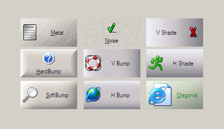
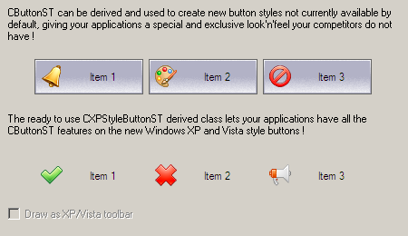
- Can be derived to create other button styles not supplied by default
- Full Unicode support
- Cost-less implementation in existing applications
Click here to see a real-world application made using CButtonST.
How to integrate CButtonST in your application
In your project include the following files:
- BtnST.h
- BtnST.cpp
- memdc.h
This 3rd party class gives you the ability to show menus using the most recent visual styles as seen
on the latest Microsoft products or even in Windows XP.
Latest BCMenu version can be found here.
To enable support for BCMenu the following two lines in BtnST.h must be enabled:
#define	BTNST_USE_BCMENU
#include "BCMenu.h"
Also, the following files must be included in your project:
- BCMenu.h
- BCMenu.cpp
Starting from version 3.6, CButtonST can play sounds on particular button states.
To enable support for sound the following line in BtnST.h must be enabled:
#define BTNST_USE_SOUNDThis gives access to the SetSound method.
Create a CButtonST object statically
With dialog editor create a standard button called, for example, IDOK (you don't need to make it owner drawn) and create a member variable for this button:
CButtonST m_btnOk;Now attach the button to CButtonST. For dialog-based applications, in your OnInitDialog:
// Call the base-class method
CDialog::OnInitDialog();

// Create the IDOK button
m_btnOk.SubclassDlgItem(IDOK, this);
Or in your DoDataExchange:
// Call the base method
CDialog::DoDataExchange(pDX);

// Create the IDOK button
DDX_Control(pDX, IDOK, m_btnOk);
Create a CButtonST object dynamically
In your application, create a member variable for the button. Please note that this variable is a pointer:
CButtonST* m_pbtnOk;Now create the button. For dialog-based applications, in your OnInitDialog:
// Call the base-class method
CDialog::OnInitDialog();

// Create the IDOK button
m_pbtnOk = new CButtonST;
m_pbtnOk->Create(_T("&Ok"), WS_CHILD | WS_VISIBLE | WS_GROUP | WS_TABSTOP, CRect(10, 10, 200, 100), this, IDOK);
// Set the same font of the application
m_pbtnOk->SetFont(GetFont());
Remember to destroy the button or you will get a memory leak. This can be done, for example, in your class destructor:
if (m_pbtnOk) delete m_pbtnOk;
Class methods
SetIcon (using multi-size resources)
Assigns icons to the button.
Any previous icon or bitmap will be removed.
// Parameters:
//     [IN]   nIconIn
//            ID number of the icon resource to show when the mouse is over the button.
//            Pass NULL to remove any icon from the button.
//     [IN]   nCxDesiredIn
//            Specifies the width, in pixels, of the icon to load.
//     [IN]   nCyDesiredIn
//            Specifies the height, in pixels, of the icon to load.
//     [IN]   nIconOut
//            ID number of the icon resource to show when the mouse is outside the button. Can be NULL.
//            If this parameter is the special value BTNST_AUTO_GRAY (cast to int) the second
//            icon will be automatically created starting from nIconIn and converted to grayscale.
//            If this parameter is the special value BTNST_AUTO_DARKER (cast to int) the second
//            icon will be automatically created 25% darker starting from nIconIn.
//     [IN]   nCxDesiredOut
//            Specifies the width, in pixels, of the icon to load.
//     [IN]   nCyDesiredOut
//            Specifies the height, in pixels, of the icon to load.
//
// Return value:
//      BTNST_OK
//          Function executed successfully.
//      BTNST_INVALIDRESOURCE
//          Failed loading the specified resource.
//
DWORD SetIcon(int nIconIn, int nCxDesiredIn, int nCyDesiredIn, int nIconOut = NULL, int nCxDesiredOut = 0, int nCyDesiredOut = 0)
SetIcon (using resources)
Assigns icons to the button.
Any previous icon or bitmap will be removed.
// Parameters:
//     [IN]   nIconIn
//            ID number of the icon resource to show when the mouse is over the button.
//            Pass NULL to remove any icon from the button.
//     [IN]   nIconOut
//            ID number of the icon resource to show when the mouse is outside the button. Can be NULL.
//            If this parameter is the special value BTNST_AUTO_GRAY (cast to int) the second
//            icon will be automatically created starting from nIconIn and converted to grayscale.
//            If this parameter is the special value BTNST_AUTO_DARKER (cast to int) the second
//            icon will be automatically created 25% darker starting from nIconIn.
//
// Return value:
//      BTNST_OK
//          Function executed successfully.
//      BTNST_INVALIDRESOURCE
//          Failed loading the specified resource.
//
DWORD SetIcon(int nIconIn, int nIconOut = NULL)
SetIcon (using handles)
Assigns icons to the button.
Any previous icon or bitmap will be removed.
// Parameters:
//     [IN]   hIconIn
//            Handle fo the icon to show when the mouse is over the button.
//            Pass NULL to remove any icon from the button.
//     [IN]   hIconOut
//            Handle to the icon to show when the mouse is outside the button. Can be NULL.
//            If this parameter is the special value BTNST_AUTO_GRAY the second
//            icon will be automatically created starting from hIconIn and converted to grayscale.
//            If this parameter is the special value BTNST_AUTO_DARKER the second
//            icon will be automatically created 25% darker starting from hIconIn.
//
// Return value:
//      BTNST_OK
//          Function executed successfully.
//      BTNST_INVALIDRESOURCE
//          Failed loading the specified resource.
//
DWORD SetIcon(HICON hIconIn, HICON hIconOut = NULL)
SetBitmaps (using resources)
Assigns bitmaps to the button.
Any previous icon or bitmap will be removed.
// Parameters:
//     [IN]   nBitmapIn
//            ID number of the bitmap resource to show when the mouse is over the button.
//            Pass NULL to remove any bitmap from the button.
//     [IN]   crTransColorIn
//            Color (inside nBitmapIn) to be used as transparent color.
//     [IN]   nBitmapOut
//            ID number of the bitmap resource to show when the mouse is outside the button.
//            Can be NULL.
//     [IN]   crTransColorOut
//            Color (inside nBitmapOut) to be used as transparent color.
//
// Return value:
//     BTNST_OK
//        Function executed successfully.
//     BTNST_INVALIDRESOURCE
//        Failed loading the specified resource.
//     BTNST_FAILEDMASK
//        Failed creating mask bitmap.
//
DWORD SetBitmaps(int nBitmapIn, COLORREF crTransColorIn, int nBitmapOut = NULL, COLORREF crTransColorOut = 0)
SetBitmaps (using handles)
Assigns bitmaps to the button.
Any previous icon or bitmap will be removed.
// Parameters:
//     [IN]   hBitmapIn
//            Handle fo the bitmap to show when the mouse is over the button.
//            Pass NULL to remove any bitmap from the button.
//     [IN]   crTransColorIn
//            Color (inside hBitmapIn) to be used as transparent color.
//     [IN]   hBitmapOut
//            Handle to the bitmap to show when the mouse is outside the button.
//            Can be NULL.
//     [IN]   crTransColorOut
//            Color (inside hBitmapOut) to be used as transparent color.
//
// Return value:
//     BTNST_OK
//        Function executed successfully.
//     BTNST_INVALIDRESOURCE
//        Failed loading the specified resource.
//     BTNST_FAILEDMASK
//        Failed creating mask bitmap.
//
DWORD SetBitmaps(HBITMAP hBitmapIn, COLORREF crTransColorIn, HBITMAP hBitmapOut = NULL, COLORREF crTransColorOut = 0)
SetFlat
Sets the button to have a standard or flat style.
// Parameters:
//     [IN]   bFlat
//            If TRUE the button will have a flat style, else
//            will have a standard style.
//            By default, CButtonST buttons are flat.
//     [IN]   bRepaint
//            If TRUE the control will be repainted.
//
// Return value:
//     BTNST_OK
//        Function executed successfully.
//
DWORD SetFlat(BOOL bFlat = TRUE, BOOL bRepaint = TRUE)
SetAlign
Sets the alignment type between icon/bitmap and text.
// Parameters:
//     [IN]   byAlign
//            Alignment type. Can be one of the following values:
//            ST_ALIGN_HORIZ          Icon/bitmap on the left, text on the right
//            ST_ALIGN_VERT           Icon/bitmap on the top, text on the bottom
//            ST_ALIGN_HORIZ_RIGHT    Icon/bitmap on the right, text on the left
//            ST_ALIGN_OVERLAP        Icon/bitmap on the same space as text
//            By default, CButtonST buttons have ST_ALIGN_HORIZ alignment.
//     [IN]   bRepaint
//            If TRUE the control will be repainted.
//
// Return value:
//     BTNST_OK
//        Function executed successfully.
//     BTNST_INVALIDALIGN
//        Alignment type not supported.
//
DWORD SetAlign(BYTE byAlign, BOOL bRepaint = TRUE)
SetTextAlign
Sets the alignment of the text inside the area reserved for the text itself.
// Parameters:
//     [IN]   byTextAlign
//            Alignment type. Can be one of the following values:
//            ST_TEXTALIGN_CENTER_VCENTER       Horizontally and vertical centered
//            ST_TEXTALIGN_LEFT_VCENTER         Left aligned and vertical centered
//            ST_TEXTALIGN_RIGHT_VCENTER        Right aligned and vertical centered
//            By default, CButtonST buttons have ST_TEXTALIGN_CENTER_VCENTER alignment but
//            in case of checkboxes or radiobuttons the default value is ST_TEXTALIGN_LEFT_VCENTER.
//     [IN]   bRepaint
//            If TRUE the control will be repainted.
//
// Return value:
//     BTNST_OK
//        Function executed successfully.
//     BTNST_INVALIDALIGN
//        Alignment type not supported.
//
DWORD SetTextAlign(BYTE byTextAlign, BOOL bRepaint = TRUE)
SetPressedStyle
Sets the pressed style.
// Parameters:
//     [IN]   byStyle
//            Pressed style. Can be one of the following values:
//            BTNST_PRESSED_LEFTRIGHT     Pressed style from left to right (as usual)
//            BTNST_PRESSED_TOPBOTTOM     Pressed style from top to bottom
//            By default, CButtonST buttons have BTNST_PRESSED_LEFTRIGHT style.
//     [IN]   bRepaint
//            If TRUE the control will be repainted.
//
// Return value:
//     BTNST_OK
//        Function executed successfully.
//     BTNST_INVALIDPRESSEDSTYLE
//        Pressed style not supported.
//
DWORD SetPressedStyle(BYTE byStyle, BOOL bRepaint = TRUE)
SetCheck
Sets the state of the checkbox.
If the button is not a checkbox, this function has no meaning.
// Parameters:
//     [IN]   nCheck
//            1 to check the checkbox.
//            0 to un-check the checkbox.
//     [IN]   bRepaint
//            If TRUE the control will be repainted.
//
// Return value:
//     BTNST_OK
//        Function executed successfully.
//
DWORD SetCheck(int nCheck, BOOL bRepaint = TRUE)
GetCheck
Returns the current state of the checkbox.
If the button is not a checkbox, this function has no meaning.
// Return value:
//     The current state of the checkbox.
//        1 if checked.
//        0 if not checked or the button is not a checkbox.
//
int GetCheck()
SetDefaultColors
Sets all colors to a default value.
// Parameters:
//     [IN]   bRepaint
//            If TRUE the control will be repainted.
//
// Return value:
//     BTNST_OK
//        Function executed successfully.
//
DWORD SetDefaultColors(BOOL bRepaint = TRUE)
SetColor
Sets the color to use for a particular state.
// Parameters:
//     [IN]   byColorIndex
//            Index of the color to set. Can be one of the following values:
//            BTNST_COLOR_BK_IN       Background color when mouse is over the button
//            BTNST_COLOR_FG_IN       Text color when mouse is over the button
//            BTNST_COLOR_BK_OUT      Background color when mouse is outside the button
//            BTNST_COLOR_FG_OUT      Text color when mouse is outside the button
//            BTNST_COLOR_BK_FOCUS    Background color when the button is focused
//            BTNST_COLOR_FG_FOCUS    Text color when the button is focused
//     [IN]   crColor
//            New color.
//     [IN]   bRepaint
//            If TRUE the control will be repainted.
//
// Return value:
//     BTNST_OK
//        Function executed successfully.
//     BTNST_INVALIDINDEX
//        Invalid color index.
//
DWORD SetColor(BYTE byColorIndex, COLORREF crColor, BOOL bRepaint = TRUE)
GetColor
Returns the color used for a particular state.
// Parameters:
//     [IN]   byColorIndex
//            Index of the color to get.
//            See SetColor for the list of available colors.
//     [OUT]  crpColor
//            A pointer to a COLORREF that will receive the color.
//
// Return value:
//     BTNST_OK
//        Function executed successfully.
//     BTNST_INVALIDINDEX
//        Invalid color index.
//
DWORD GetColor(BYTE byColorIndex, COLORREF* crpColor)
OffsetColor
This function applies an offset to the RGB components of the specified color.
This function can be seen as an easy way to make a color darker or lighter than its default value.
// Parameters:
//     [IN]   byColorIndex
//            Index of the color to set.
//            See SetColor for the list of available colors.
//     [IN]   shOffsetColor
//            A short value indicating the offset to apply to the color.
//            This value must be between -255 and 255.
//     [IN]   bRepaint
//            If TRUE the control will be repainted.
//
// Return value:
//     BTNST_OK
//        Function executed successfully.
//     BTNST_INVALIDINDEX
//        Invalid color index.
//     BTNST_BADPARAM
//        The specified offset is out of range.
//
DWORD OffsetColor(BYTE byColorIndex, short shOffset, BOOL bRepaint = TRUE)
SetAlwaysTrack
Sets the hilight logic for the button.
Applies only to flat buttons.
// Parameters:
//     [IN]   bAlwaysTrack
//            If TRUE the button will be hilighted even if the window that owns it, is
//            not the active window.
//            If FALSE the button will be hilighted only if the window that owns it,
//            is the active window.
//
// Return value:
//     BTNST_OK
//        Function executed successfully.
//
DWORD SetAlwaysTrack(BOOL bAlwaysTrack = TRUE)
SetBtnCursor
Sets the cursor to be used when the mouse is over the button.
// Parameters:
//     [IN]   nCursorId
//            ID number of the cursor resource.
//            Pass NULL to remove a previously loaded cursor.
//     [IN]   bRepaint
//            If TRUE the control will be repainted.
//
// Return value:
//     BTNST_OK
//        Function executed successfully.
//     BTNST_INVALIDRESOURCE
//        Failed loading the specified resource.
//
DWORD SetBtnCursor(int nCursorId = NULL, BOOL bRepaint = TRUE)
DrawBorder
Sets if the button border must be drawn.
Applies only to flat buttons.
// Parameters:
//     [IN]   bDrawBorder
//            If TRUE the border will be drawn.
//     [IN]   bRepaint
//            If TRUE the control will be repainted.
//
// Return value:
//     BTNST_OK
//        Function executed successfully.
//
DWORD DrawBorder(BOOL bDrawBorder = TRUE, BOOL bRepaint = TRUE)
DrawFlatFocus
Sets if the focus rectangle must be drawn for flat buttons.
// Parameters:
//     [IN]   bDrawFlatFocus
//            If TRUE the focus rectangle will be drawn also for flat buttons.
//     [IN]   bRepaint
//            If TRUE the control will be repainted.
//
// Return value:
//     BTNST_OK
//        Function executed successfully.
//
DWORD DrawFlatFocus(BOOL bDrawFlatFocus, BOOL bRepaint = TRUE)
SetTooltipText (Using resource)
Sets the text to show in the button tooltip.
// Parameters:
//     [IN]   nText
//            ID number of the string resource containing the text to show.
//     [IN]   bActivate
//            If TRUE the tooltip will be created active.
//
void SetTooltipText(int nText, BOOL bActivate = TRUE)
SetTooltipText
Sets the text to show in the button tooltip.
// Parameters:
//     [IN]   lpszText
//            Pointer to a null-terminated string containing the text to show.
//     [IN]   bActivate
//            If TRUE the tooltip will be created active.
//
void SetTooltipText(LPCTSTR lpszText, BOOL bActivate = TRUE)
EnableBalloonTooltip
Enables the tooltip to be displayed using the balloon style.
This function must be called before any call to SetTooltipText is made.
// Return value:
//     BTNST_OK
//        Function executed successfully.
//
DWORD EnableBalloonTooltip()
ActivateTooltip
Enables or disables the button tooltip.
// Parameters:
//     [IN]   bActivate
//            If TRUE the tooltip will be activated.
//
void ActivateTooltip(BOOL bEnable = TRUE)
GetDefault
Returns if the button is the default button.
// Return value:
//     TRUE
//        The button is the default button.
//     FALSE
//        The button is not the default button.
//
BOOL GetDefault()
DrawTransparent
Enables the transparent mode.
Note: this operation is not reversible.
DrawTransparent should be called just after the button is created.
Do not use trasparent buttons until you really need it (you have a bitmapped
background) since each transparent button makes a copy in memory of its background.
This may bring unnecessary memory use and execution overload.
// Parameters:
//     [IN]   bRepaint
//            If TRUE the control will be repainted.
//
void DrawTransparent(BOOL bRepaint = FALSE)
SetURL
Sets the URL that will be opened when the button is clicked.
// Parameters:
//     [IN]   lpszURL
//            Pointer to a null-terminated string that contains the URL.
//            Pass NULL to removed any previously specified URL.
//
// Return value:
//     BTNST_OK
//        Function executed successfully.
//
DWORD SetURL(LPCTSTR lpszURL = NULL)
SetMenu
Associates a menu to the button.
The menu will be displayed clicking the button.
This method is available only if BTNST_USE_BCMENU is not defined.
// Parameters:
//     [IN]   nMenu
//            ID number of the menu resource.
//            Pass NULL to remove any menu from the button.
//     [IN]   hParentWnd
//            Handle to the window that owns the menu.
//            This window receives all messages from the menu.
//     [IN]   bRepaint
//            If TRUE the control will be repainted.
//
// Return value:
//     BTNST_OK
//        Function executed successfully.
//     BTNST_INVALIDRESOURCE
//        Failed loading the specified resource.
//
DWORD SetMenu(UINT nMenu, HWND hParentWnd, BOOL bRepaint = TRUE)
SetMenu
Associates a menu to the button.
The menu will be displayed clicking the button.
This method is available only if BTNST_USE_BCMENU is defined. The menu will be handled by the BCMenu class.
// Parameters:
//     [IN]   nMenu
//            ID number of the menu resource.
//            Pass NULL to remove any menu from the button.
//     [IN]   hParentWnd
//            Handle to the window that owns the menu.
//            This window receives all messages from the menu.
//     [IN]   bWinXPStyle
//            If TRUE the menu will be displayed using the new Windows XP style.
//            If FALSE the menu will be displayed using the standard style.
//     [IN]   nToolbarID
//            Resource ID of the toolbar to be associated to the menu.
//     [IN]   sizeToolbarIcon
//            A CSize object indicating the size (in pixels) of each icon into the toolbar.
//            All icons into the toolbar must have the same size.
//     [IN]   crToolbarBk
//            A COLORREF value indicating the color to use as background for the icons into the toolbar.
//            This color will be used as the "transparent" color.
//     [IN]   bRepaint
//            If TRUE the control will be repainted.
//
// Return value:
//     BTNST_OK
//        Function executed successfully.
//     BTNST_INVALIDRESOURCE
//        Failed loading the specified resource.
//
DWORD SetMenu(UINT nMenu,
              HWND hParentWnd,
              BOOL bWinXPStyle = TRUE,
              UINT nToolbarID = NULL,
              CSize sizeToolbarIcon = CSize(16, 16),
              COLORREF crToolbarBk = RGB(255, 0, 255),
              BOOL bRepaint = TRUE)
SetMenuCallbackSets the callback message that will be sent to the
specified window just before the menu associated to the button is displayed.
// Parameters:
//     [IN]   hWnd
//            Handle of the window that will receive the callback message.
//            Pass NULL to remove any previously specified callback message.
//     [IN]   nMessage
//            Callback message to send to window.
//     [IN]   lParam
//            A 32 bits user specified value that will be passed to the callback function.
//
// Remarks:
//     the callback function must be in the form:
//     LRESULT On_MenuCallback(WPARAM wParam, LPARAM lParam)
//     Where:
//            [IN]     wParam
//                     If support for BCMenu is enabled: a pointer to BCMenu
//                     else a HMENU handle to the menu that is being to be displayed.
//            [IN]     lParam
//                     The 32 bits user specified value.
//
// Return value:
//     BTNST_OK
//        Function executed successfully.
//
DWORD SetMenuCallback(HWND hWnd, UINT nMessage, LPARAM lParam = 0)
SizeToContent
Resizes the button to the same size of the image.
To get good results both the IN and OUT images should have the same size.
void SizeToContent()SetAutofire
Enables or disables the autofire feature.
Applies only to real buttons, not to checkboxes or radiobuttons.
// Parameters:
//     [IN]   bAutofire
//            If TRUE the button will have the autofire feature enabled. This means
//            that BN_CLICKED messages will be sent to the window owning the button
//            for all the time the button is pressed.
//            The initial delay and the frequency of the sent messages are the
//            same of the keyboard configuration.
//            If FALSE the button will have the autofire feature disabled.
//            This is the default.
//
// Return value:
//     BTNST_OK
//        Function executed successfully.
//     BTNST_NOTSUPPORTED
//        Autofire feature is not supported for checkbox and radiobuttons.
//
DWORD SetAutofire(BOOL bAutofire = TRUE)
SetSound
Sets the sound that must be played on particular button states.
This method is available only if BTNST_USE_SOUND is defined.
// Parameters:
//     [IN]   lpszSound
//            A string that specifies the sound to play.
//            If hMod is NULL this string is interpreted as a filename, else it
//            is interpreted as a resource identifier.
//            Pass NULL to remove any previously specified sound.
//     [IN]   hMod
//            Handle to the executable file that contains the resource to be loaded.
//            This parameter must be NULL unless lpszSound specifies a resource identifier.
//     [IN]   bPlayOnClick
//            TRUE if the sound must be played when the button is clicked.
//            FALSE if the sound must be played when the mouse is moved over the button.
//     [IN]   bPlayAsync
//            TRUE if the sound must be played asynchronously.
//            FALSE if the sound must be played synchronously. The application takes control
//            after the sound is completely played.
//
// Return value:
//     BTNST_OK
//        Function executed successfully.
//
DWORD SetSound(LPCTSTR lpszSound,
               HMODULE hMod = NULL,
               BOOL bPlayOnClick = FALSE,
               BOOL bPlayAsync = TRUE)
OnDrawBackgroundThis function is called every time the button background needs to be painted.
If the button is in transparent mode this function will NOT be called.
This is a virtual function that can be rewritten in CButtonST-derived classes
to produce a whole range of buttons not available by default.
// Parameters:
//     [IN]   pDC
//            Pointer to a CDC object that indicates the device context.
//     [IN]   pRect
//            Pointer to a CRect object that indicates the bounds of the
//            area to be painted.
//
// Return value:
//     BTNST_OK
//        Function executed successfully.
//
virtual DWORD OnDrawBackground(CDC* pDC, CRect* pRect)
OnDrawBorder
This function is called every time the button border needs to be painted.
This is a virtual function that can be rewritten in CButtonST-derived classes
to produce a whole range of buttons not available by default.
// Parameters:
//     [IN]   pDC
//            Pointer to a CDC object that indicates the device context.
//     [IN]   pRect
//            Pointer to a CRect object that indicates the bounds of the
//            area to be painted.
//
// Return value:
//     BTNST_OK
//        Function executed successfully.
//
virtual DWORD OnDrawBorder(CDC* pDC, CRect* pRect)
GetVersionI
Returns the class version as a short value.
// Return value:
//     Class version. Divide by 10 to get actual version.
//
static short GetVersionI()
GetVersionC
Returns the class version as a string value.
// Return value:
//     Pointer to a null-terminated string containig the class version.
//
static LPCTSTR GetVersionC()
History
- v4.2 (13/July/2007)
Default font is now rendered with anti-aliasing effect
Now compiles under Visual C++ 2005 - v4.1 (01/November/2004)
Added support for autofire feature
Added SetAutofire method
Text alignment can now be set also from resource editor - v4.0 (22/June/2004)
Added support for radio buttons
Flicker-free drawing
Added SetTextAlign method
Class now takes track of the system and/or modified colors
Encapsulated into the SoftechSoftware DLL - v3.9 (03/March/2003)
Added support for Windows XP icons
Added support for multi-size icons
Added BTNST_AUTO_DARKER as a special value for second icon
Fixed the grayscale icon bug under Win9x/Me
Class is now indipendent from TTS_BALLOON - v3.8 (25/November/2002)
Added support for balloon tooltips
Added EnableBalloonTooltip method
OnDrawBorder virtual method is now called also for non-flat buttons
OnDrawBackground and OnDrawBorder now receive a correct CRect* parameter
Fixed a little color bug
Correctly works under MFC 7.0 - v3.7 (22/July/2002)
Added SetPressedStyle method
Added BTNST_INVALIDPRESSEDSTYLE return value
Added ST_ALIGN_OVERLAP align style - v3.6 (09/July/2002)
Added SetMenuCallback method to give the ability
to modify the associated menu just before is it displayed
Added basic support for sounds
Added SetSound method
Added ResizeToContent method - v3.5 (18/April/2002)
Second icon can be automatically created in grayscale
Added BTNST_AUTO_GRAY as a special value for second icon
Bitmap is draw disabled if the button is disabled
Added support for owner draw menus (using BCMenu class)
Added an overloaded SetMenu method to support BCMenu class
Added OffsetColor method
Added support for DDX_Check calls - v3.4 (17/October/2001)
Added basic support for menus
Added SetMenu method - v3.3 (20/September/2001)
Default button is now handled correctly
Removed some rarely used methods
Other optimizations - v3.2 (14/June/2001)
Added support for bitmaps
Added SetBitmaps methods - v2.6
Added an overloaded version of the SetIcon method
Added ST_ALIGN_HORIZ_RIGHT flag to SetAlign function
Fixed a bug when used in MFC extension DLLs
Improved code for transparent buttons - v2.5
Support for 16x16 32x32 and 48x48 icons
Buttons can be dinamically created
Added support for transparent buttons
Auto-detect default button (useful only for standard buttons)
Auto-detect icon's dimension
Added DrawTransparent method
Added GetDefault method
Modified SetIcon method - v2.4
Added support for tooltips
Added SetTooltipText, ActivateTooltip members
The "Double-click bug" should be fixed - v2.3
The class should now work from within a DLL
The "Spacebar-Bug" should be fixed
Added RedrawWindow() as the last line of SetIcon member
The focus rectangle is now the last thing drawn
The focus rectangle can now be drawn also for "flat" buttons
Added SetFlatFocus, GetFlatFocus members
Added SetBtnCursor member
Flat buttons can now work like in IE - v2.2
Removed SubclassDlgItem member (this is transparent for the user)
Added PreSubclassWindow member (this allows DDX_ calls)
Added SetDefaultActiveFgColor, SetActiveFgColor, GetActiveFgColor members
Added SetDefaultActiveBgColor, SetActiveBgColor, GetActiveBgColor members
Added SetDefaultInactiveFgColor, SetInactiveFgColor, GetInactiveFgColor members
Added SetDefaultInactiveBgColor, SetInactiveBgColor, GetInactiveBgColor members
When the mouse is over a button the focus now remains to the control that owns it!
The flat buttons now work properly also in windows not derived from CDialog!
A memory DC (CMemDC) is used to draw the button. This should speeds up the graphic operations. - v2.1
Support for two icons
Modified SetIcon member
Added SetShowText/GetShowText members
Fixed a bug dealing with the left mouse button
Little optimizations - v2.0
Changed the class name for name convention
Support for 256 colors icons
Removed a stupid memory leak!
Removed support for CImagelists
Documentation in HTML format - ST_CButton v1.1
Some minor changes - ST_CButton v1.0
First release
Remarks
The demo application shows nearly all the features of the CButtonST class.
CButtonST architecture makes possible to produce a whole range
of buttons not available by default. If someone implements new button styles I
will be happy to include his code in the next CButtonST demo
application.
Disclaimer and usage terms
The software and the accompanying files are distributed "AS IS" and without any warranties whether expressed or implied.
No responsibilities for possible damages or even functionality can be taken.
The user must assume the entire risk of using this software.
The sample application and the source codes (where available) are for demostration purposes only. You are not allowed to
use the demo source codes, libraries and DLLs in any of your application. If you like this software you must buy
the full version.
Downloading anything from this site means you accept the above terms.